
Explore
Features
Explore
This feature enable a much deeper reporting and analysis capability by accessing all the tables and creating custom queries, dashboards and reports. This is only available for users in the standard license.
When accessing Explore you will find the following interface:
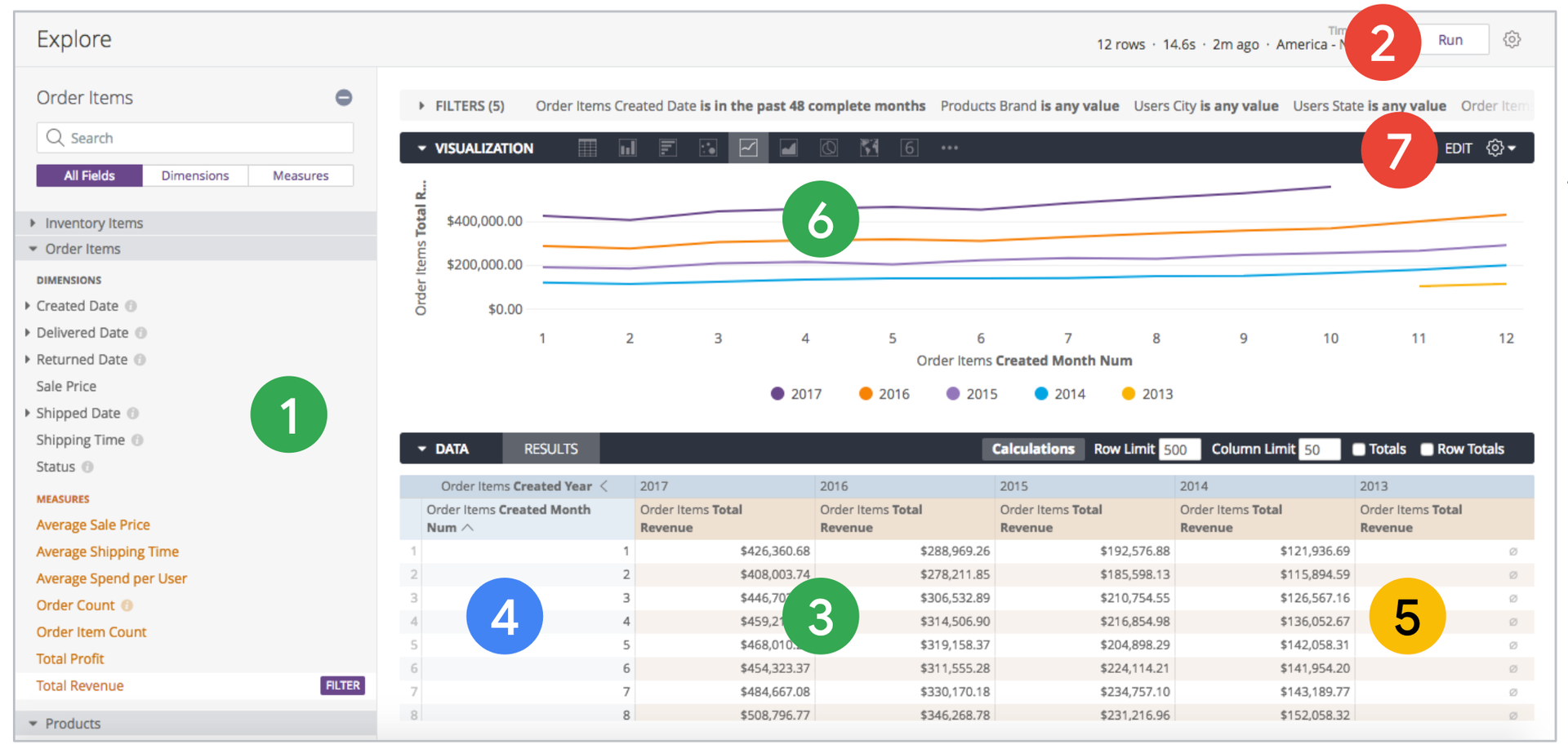
- Field Picker
- Run
- Data Table
- Dimensions in blue
- Measures in orange
- Visualisation
- Edit Visualisation
Four main concepts are key to explore data in Toqio Analytics:
Dimensions: These are the columns of your data, which may be physical (exist as columns in the database) or logical (such as a calculation or translation of actual data)
Measures: Aggregations and calculations across one or many rows, such as a sum, minimum, maximum or count
Filters: Limits for your data, which behave differently when you are filtering a dimension vs. a measure
Pivots: A way of turning a dimension into several columns, allowing for exploration across multiple groups
Practical guidance to Explore
As a practical exercise, we are going to provide some step by step guidance on a few topics related to the exploration and interpretation of the data in Explore.
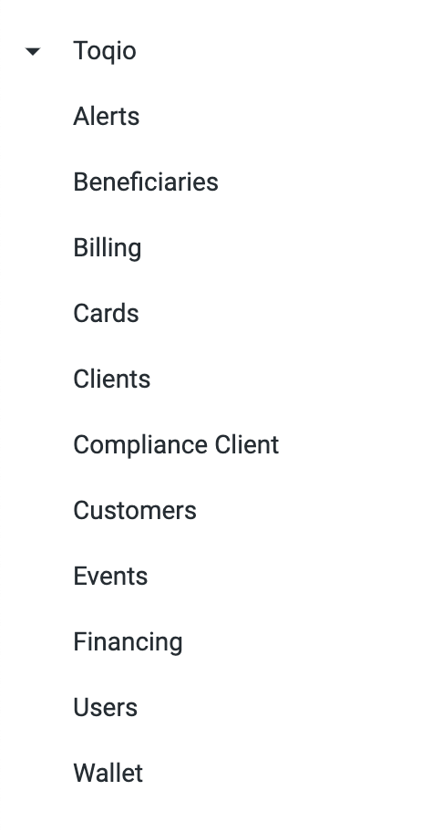
So, imagine you need to determine how many users there are in total which name is Michael, and you want to show a graph on creation month of these guys. So, if you go to Explore as a first step, this list of tables will be shown:
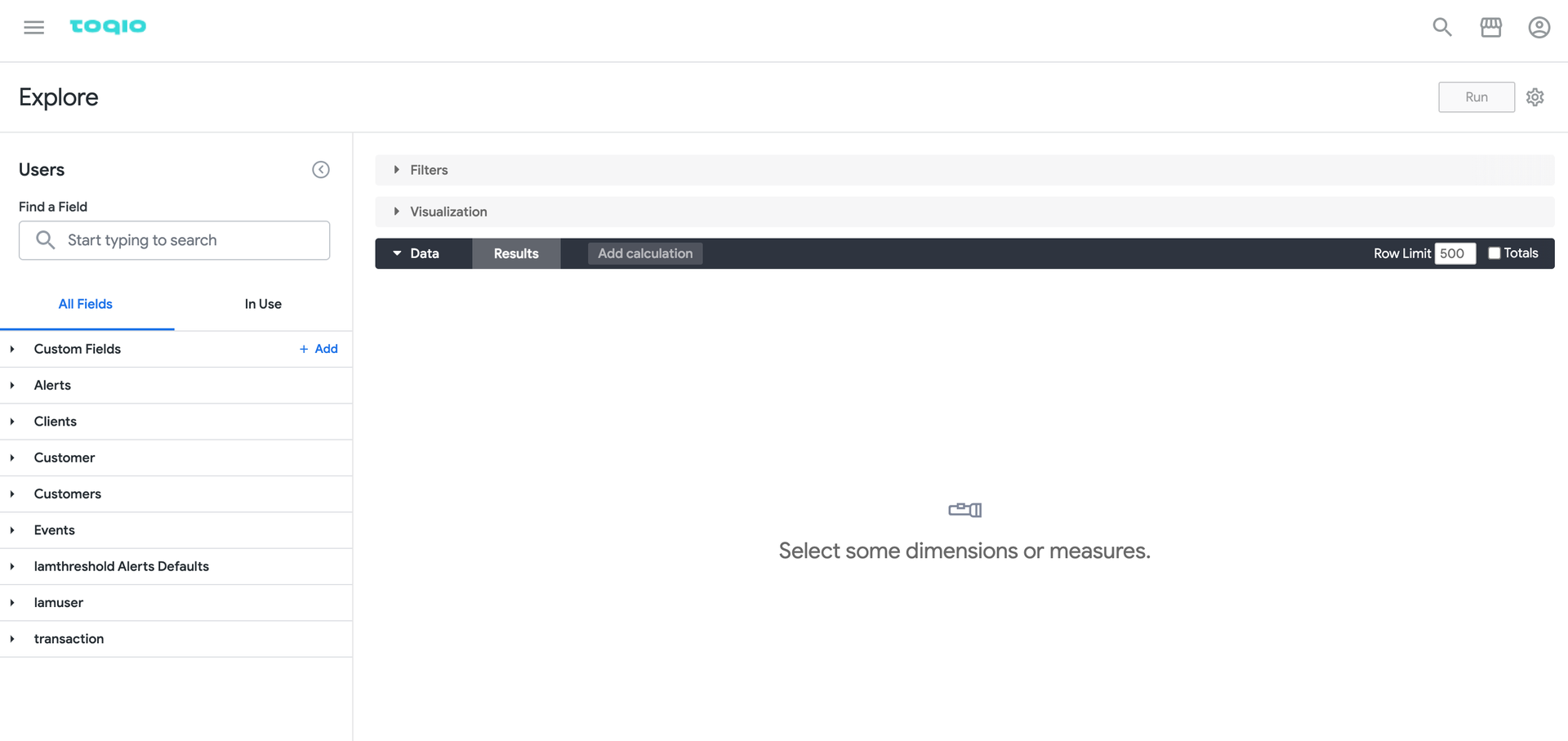
For this exercise we will then go to the model Users and then we will see the explore interface with some associated tables (left hand section):
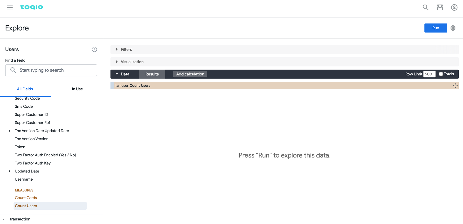
So, we will go to the table “iamuser” to evaluate the available fields and then select the measure “Count Users” by clicking on it. This will add the measure to the data table:
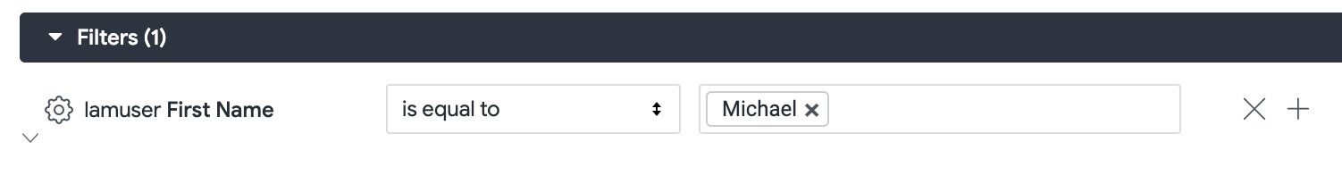
Now I need to filter those users named “Michael”. So, I go to the field “First Name” and I must filter it by clicking in the icon to Filter by field:

Then, in the filters section you will find some filtering options for the field. In our case we are looking for users with “Michael“ as First Name so we will use the operator “is equal to”:
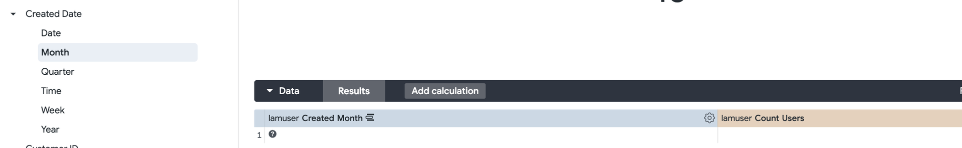
If we click on RUN, on top right corner, we will have our first response, number of users with Michael as First Name in the visualisation block. Now we want to show a graph to analyse when these users have been created and its evolution in time. Then we need to add another parameter to the query, a dimension: Created Date > Month in the table “iamuser”:
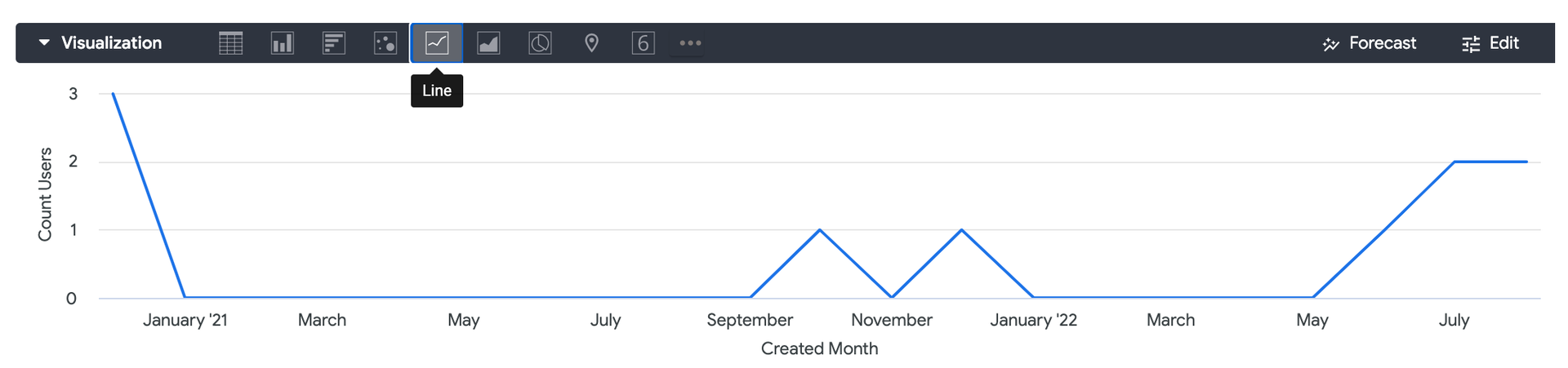
At this point we just need to run the query again and select how the graph must be presented:
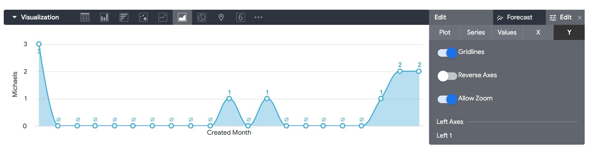
To go further and improve the graph you can select other visualisation options and Edit the one selected:
And we have our result. Now we just need to save it to a custom Dashboard so it will be available along my organisation. Close to the Run button you can find an Explore actions icon. By clicking on it a menu will be presented:
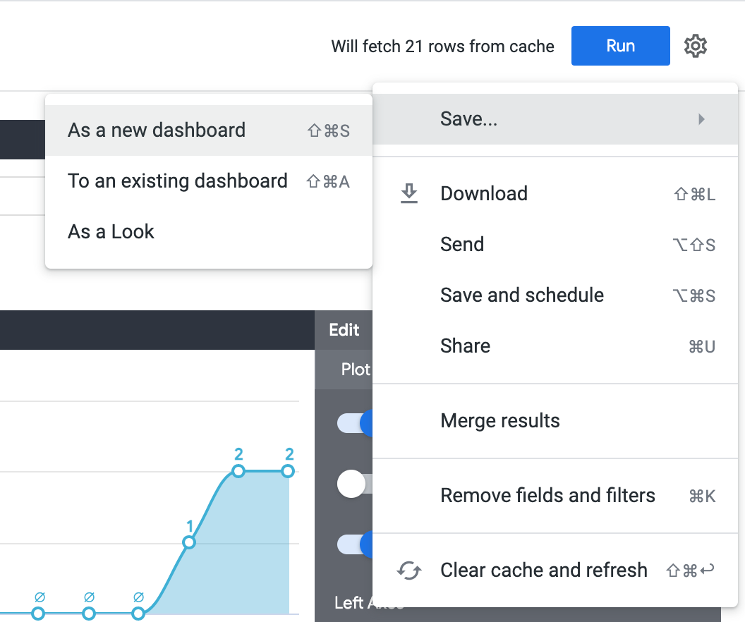
Along other options we have been reviewing already, you will find a submenu to Save. You can add the visualization to an existing dashboard or create a new one, only available to your team. Also, you can save it as a Look in case you need to add a higher level of automation to the scheduled reports.
Updated 7 months ago