
Nigiri Design System
What is Nigiri design system?
A design system is a collection of building blocks for designing and developing websites and apps.
The Nigiri design system was built to focus on giving clients the ability to customize every aspect of their offering.
The purpose of the product must be clearly visible in the design system and in final designs.
These principles are focused on the primary values that need to be conveyed.
Neutral As a white label, Toqio tries to avoid an overly strong visual identity, opting instead to be demure and discreet.
Flexible Each modular piece of the Toqio platform has been designed to be totally customizable so that clients can do as they wish, visually speaking.
Adaptable The platform is protean and adapts to a myriad of use cases, as different clients have very different goals in mind.
The Nigiri Design System includes things like buttons, navigation and form fields — and defines how they should look and behave.
Design systems codify information, including styles, colors, typography, and other details included in UI elements. This collection of standards, principles, and instructions makes the design system valuable as a single reference for the entire organization.
Nigiri’s mission
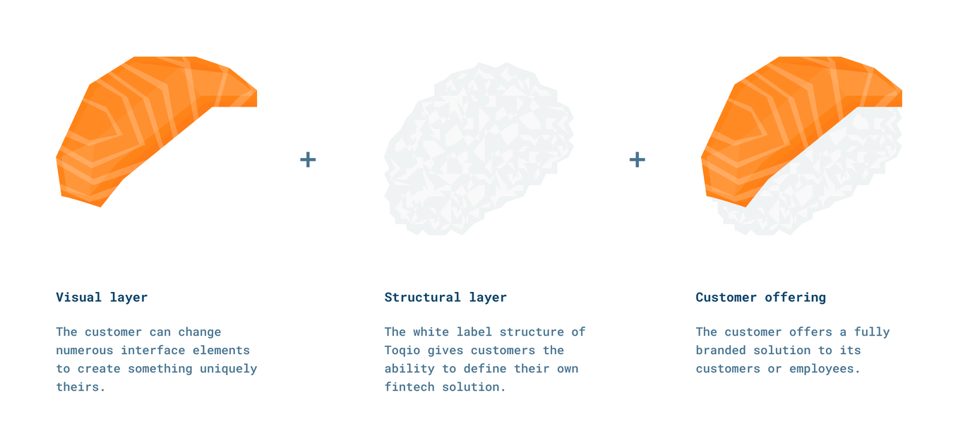
Nigiri, as Toqio’s design system, represents the capability of the system to offer visual layers resting comfortably upon a powerful structural layer.
Consequently, **Toqio clients can easily control the look and feel of their own digital banking platforms. By customizing the visual layer that lays atop the Toqio platform, clients can customize their offering to create a branded solution that is specific to their needs.
Though underlying functions may be similar, the final result is completely unique.
Structure
Nigiri is based on atomic design logic. Atomic design is not a linear process, but rather a mental model to help us think of our user interfaces as both a cohesive whole and a collection of parts at the same time.
The four levels of atomic design elements play a key role in the hierarchy of our interface design system.
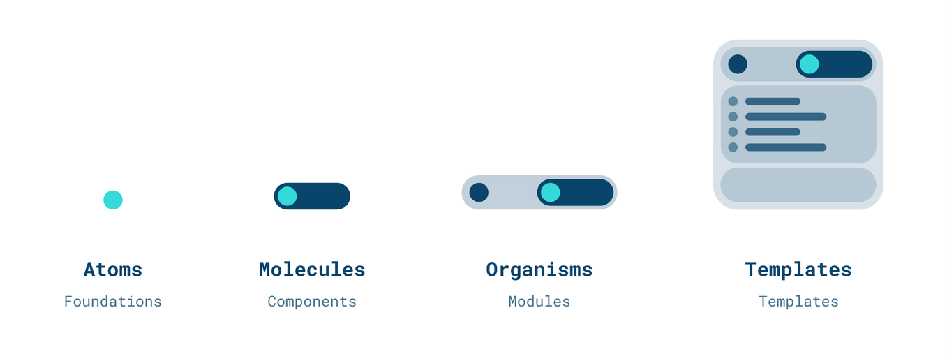
This structure allows us to establish guidelines in order to build digital products.
These rules are derived from a series of elements that are reused to achieve consistency and efficiency. Nigiri is built (and is evolving) to be modular, allowing elements to scale and support functions, no matter how basic or complex.
Customization
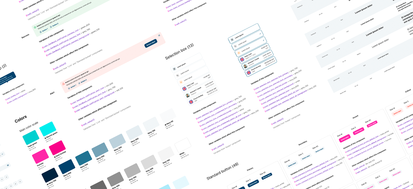
Toqio's customization model works thanks to a huge set of variables applied to each Nigiri component and module.
This allows for a high level of granularity in terms of customizing elements independently in order to get the proper style.
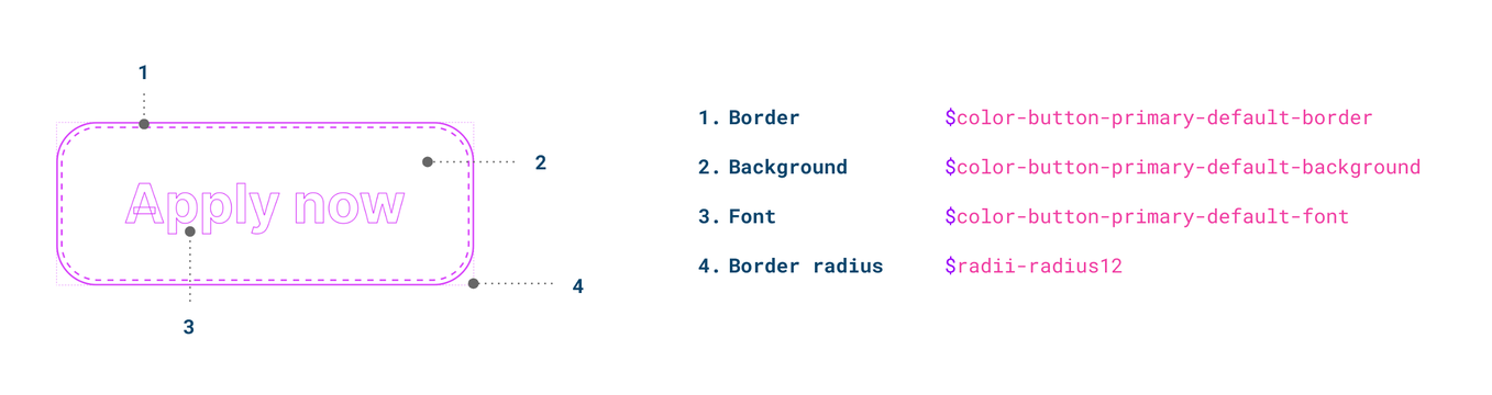
Through a rich variable system, each of the components of the design system that make up the interface can be customized.
By modifying the value of each variable, the component appearance can be completely changed. As a result, a massive number of possible appearances are available during customization.
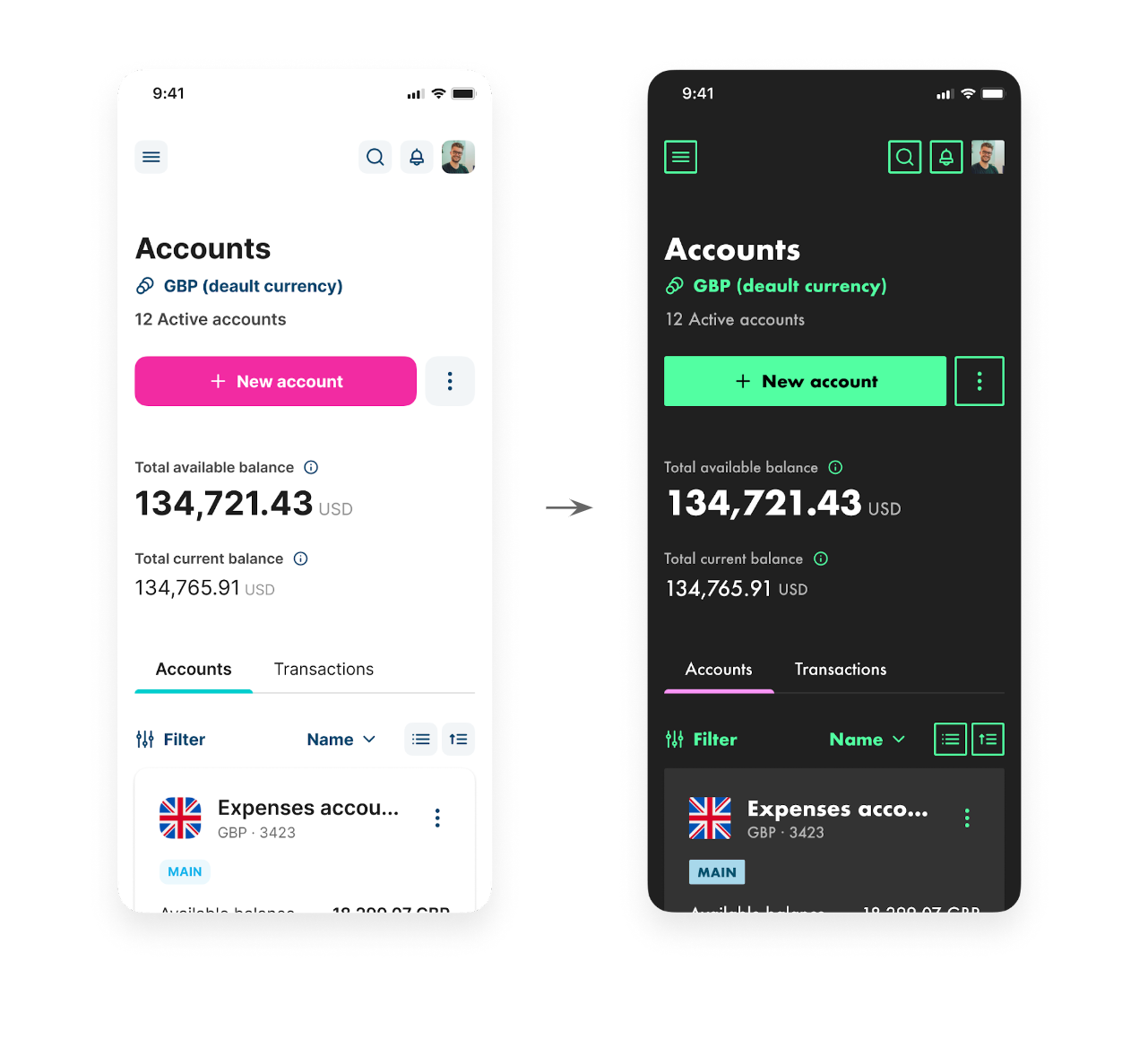
This logic, which is applied to every single element of the interface, ensures Toqio’s default look and feel can be completely changed to create a vastly different and unique style through customization.
o matter where you go within the Toqio platform, customization options are always present and can be as holistic or as specific as required. Clients can change all occurrences of a component, for example, or just one in particular.
The libraries
All Nigiri components are documented on the Zeroheight platform. There are two different libraries: The web library and the app library. Both libraries specify the anatomy, variants, states, usage, customization capabilities and development specifications of each of the foundations, components and modules that make up the interface of the platforms.
You can find a link in each of the component pages that will take you to the specific documentation for developers, hosted on the Storybook platform.
Updated 7 months ago